

Xponent21
29 Case Studies
A Xponent21 Case Study
The Partnership for Housing Affordability, a leading policy organization in the Richmond region, approached Xponent21 for branding services. Their challenge was to create a new logo that would effectively encapsulate their mission of improving housing affordability through collaboration and innovation, while communicating trust and progress.
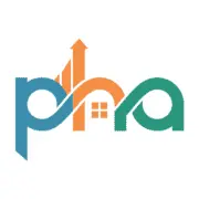
Xponent21 implemented a comprehensive logo creation process involving discovery, idea generation, and refinement. The final design featured interlinked letters to symbolize partnership, an upward arrow for progress, and a house icon for their focus. The strategic color palette of blue, orange, and green reinforced trust, energy, and growth. The result was a new brand identity that clearly communicates the organization's role as a trustworthy partner dedicated to making housing accessible. Xponent21 successfully delivered a visual identity that supports the customer's core mission.
29 Case Studies