


Vataga Agency
65 Case Studies
A Vataga Agency Case Study
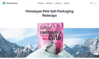
Pripravka, a food brand, faced the challenge of its Himalayan Pink Salt packaging being overlooked and generic on store shelves. They engaged Vataga Agency to transform the packaging into a modern and visible design that would distinguish the product from its competitors and elevate its status.
Vataga Agency implemented a comprehensive redesign, developing a new concept that used bright, emotional colors like pastel pink, turquoise, and coral to highlight the product's natural advantages. They modernized the typography, replaced the mountain photo with a concise graphic, and added clear messaging about the salt's benefits. The solution created a standout shelf presence for Pripravka's Himalayan Pink Salt, effectively communicating that boring salt is a thing of the past.
65 Case Studies