


Toast Creative
77 Case Studies
A Toast Creative Case Study
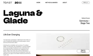
The customer Sanctuary, a property developer, faced the challenge of maintaining a consistent and authentic masterplan brand identity while introducing new staged additions: the Laguna and Glade residences and the Revive health club. The vendor Toast Creative was engaged to provide branding and strategic visioning services to ensure these new elements were united under the Sanctuary masterplan's core message of harmony and liveability.
Toast Creative's solution was to create unique yet cohesive kaleidoscopic logotypes for each new element, inspired by principles of Japanese design. The Laguna logo captures a fluid, aqueous serenity, the Glade logo integrates flora-inspired vitality, and the Revive logo reflects tranquil, restorative qualities. This approach successfully tied all developments together under the Sanctuary masterplan, delivering a united brand image and a unique, vibrant living experience for the community.
77 Case Studies