

SO Creative Studio
40 Case Studies
A SO Creative Studio Case Study
SO Creative Studio was selected by William Ransom & Son Plc, one of the UK's oldest natural healthcare companies, following a three-way pitch. The customer's challenge was to reposition the company and required a completely refreshed brand identity design that could reproduce effectively on very small product packaging.
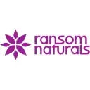
SO developed an iconic logo symbolizing natural and global elements by positioning leaf shapes to point in the cardinal directions, prioritizing simplicity. The vendor also created the logo and packaging design for the Ransom Naturals product range, in addition to exhibition design and an annual report. The Chief Executive stated the process was smooth, the output could not have been better, and delivery was on time and to budget.
40 Case Studies