


Red Stone
61 Case Studies
A Red Stone Case Study
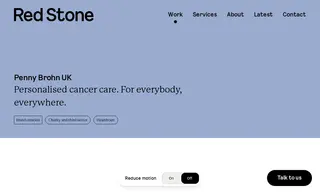
Penny Brohn UK, a cancer health and wellbeing charity, needed to revitalize its outdated brand to better represent its diverse community and engage new supporters. They partnered with the vendor Red Stone for a comprehensive rebranding service that included brand strategy and visual identity development.
Red Stone developed a new visual identity system anchored by a brand marque symbolizing hope. The solution included a vibrant and accessible color palette, custom typography, and a flexible graphic language, which together modernized the charity's image. The new brand successfully embedded a message of hope across all touchpoints and was recognized with multiple industry awards, including a Silver World Design Award.
61 Case Studies