


Pentagram
1049 Case Studies
A Pentagram Case Study
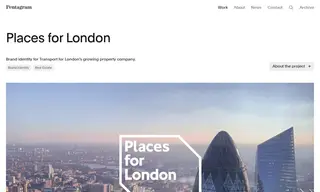
Places for London, the property company of Transport for London (TfL), faced the challenge of creating a strong, autonomous brand identity that also demonstrated its relationship to its parent organization. They needed a highly accessible and inclusive brand that could work alongside the identities of TfL, the Mayor of London, and other partners. To address this, they commissioned the design firm Pentagram to develop a new name, brand strategy, and visual identity.
Pentagram created a brand identity centered on the strategic idea ‘Minding London’s Gaps,’ visually represented by a flexible, three-dimensional graphic frame. The solution used TfL’s proprietary Johnston typeface and a comprehensive graphic system to ensure visual consistency and a subtle link to the parent brand. The result was a highly ownable and flexible visual identity that serves the business’s commercial and public-facing needs, providing a consistent style for all communications. Throughout the project, Pentagram worked side-by-side with the client to build consensus with a wide range of stakeholders.
1049 Case Studies