


Pentagram
1049 Case Studies
A Pentagram Case Study
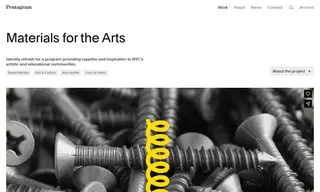
Materials for the Arts, a program of the NYC Department of Cultural Affairs and one of the country's largest creative reuse centers, sought to overhaul its visual and verbal identity to raise its profile beyond being New York City's "best kept secret." They partnered with the design firm Pentagram to develop a new brand identity that could better communicate their energy and creativity across a wide range of modern applications, from social media to digital billboards.
Pentagram created a refreshed identity anchored by a simplified, scalable logo that abstracted elements from the original mark. The solution included a vibrant yellow color palette inspired by the organization's warehouse and iconic NYC symbols, a supporting accent color palette, and a bold typeface. This new system is highly functional for the in-house team and is designed to stand out in New York's visual landscape. The rebrand launched with an event in Times Square as part of a broader campaign to raise awareness for MFTA's programs and services.
1049 Case Studies