

Mother Design
49 Case Studies
A Mother Design Case Study
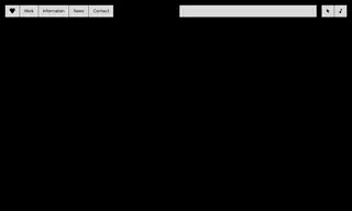
Eyebeam, a multidisciplinary nonprofit focused on social justice through art and technology, found its visual identity was limited and unable to represent the full scope of its significant work. To chart a bold vision for its future, Eyebeam partnered with Mother Design to build a new, unifying brand.
Mother Design created a comprehensive new brand identity system, including a dynamic wordmark logo that morphs to fit new contexts and a custom typeface called Eyebeam Sans. This typography uses an algorithm to randomly distribute characters, creating a unique tension between human and machine. The solution successfully provided a flexible visual system capable of containing and communicating the many dimensions of Eyebeam's artist-led organization.
49 Case Studies