


Monotype
55 Case Studies
A Monotype Case Study
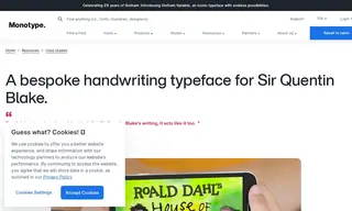
Monotype worked with noted illustrator Sir Quentin Blake to create a bespoke typeface that authentically replicated his distinctive handwriting. The challenge was to digitally capture the unique, irregular characteristics of his writing—including varying letter heights, unpredictable stroke thickness, and natural spacing—in a flexible font that could meet high demand for his work and support international languages, thereby reducing the time-consuming task of manual lettering.
The solution developed by Monotype involved creating multiple variants for each character to mimic the natural randomness of handwriting, along with careful kerning to preserve its irregular spacing. The resulting typeface successfully lessens the demand on Blake's time and has already been implemented in applications like the "Twit or Miss" app, a television program, and merchandise. Monotype delivered a typeface that provides flexibility for future projects and allows Blake's handwriting to be enjoyed authentically in a wide variety of situations.
55 Case Studies