


Manual
41 Case Studies
A Manual Case Study
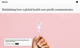
PATH, a global health organization, faced the challenge of communicating its vast and complex work across numerous health focus areas and geographies. Its existing brand lacked clarity and failed to distinguish PATH as a modern health innovator rather than a traditional NGO. The vendor Manual was engaged to conduct a brand audit and develop a new brand identity system.
Manual created a new visual identity centered on an idiosyncratic logo with geometric symbols representing PATH's diverse methods and partnerships. This system, which included photography art direction and design tools, provided coherence and a modern, optimistic feel. The result was a stronger, more unified brand that better positioned PATH with donors and partners as a global innovator, leading to more efficient resource deployment and partnership development.
41 Case Studies