


Lundgren+Lindqvist
84 Case Studies
A Lundgren+Lindqvist Case Study
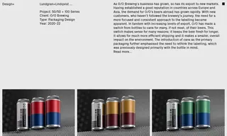
O/O Brewing, a growing brewery with increasing export markets, faced a challenge as it switched its primary packaging from bottles to cans. Their existing labeling, designed for bottles, needed a more focused and consistent approach to appeal to new international customers who were unfamiliar with the brand. They engaged the design studio Lundgren+Lindqvist to develop a new packaging design system.
Lundgren+Lindqvist created a modular label architecture built around a prominent black stripe for the beer name and a large canvas area, a consistent element from the brewery's history. For the 50/50 Series, they developed a distinct color system where each hop type is assigned a specific color, visually represented by a canvas split into two abstract landscape halves. The success of this series led to the creation of the follow-up 100 Series. The new design provided a refreshing and consistent departure from overly decorated beer labels, supporting O/O Brewing's rapid growth and expansion into new markets.
84 Case Studies