

KAT Marketing
50 Case Studies
A KAT Marketing Case Study
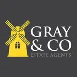
Gray & Co Estate Agents, a family-owned estate agency specializing in rural properties, approached KAT Marketing for a graphic design rebrand. Their challenge was to create a new, bold identity that would make them stand out, particularly on their 'For Sale' signs, while still appearing sleek and modern to reflect their business approach.
KAT Marketing developed a striking branding solution using a client-requested bright yellow contrasted with a muted grey. This was combined with clear lettering and a modern windmill logo. The resulting design was intended to make Gray & Co one of the most recognizable estate agents in their region.
50 Case Studies