


Harley Johnston Design
17 Case Studies
A Harley Johnston Design Case Study
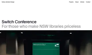
The NSW Public Libraries Association engaged Harley Johnston Design to update the way its annual Switch conference presents itself to the world. The challenge was to create a refreshed brand identity that captured the essence of the well-loved event, which brings together the state's library workforce for education, networking, and celebration.
Harley Johnston Design delivered an updated brand identity, logo design, and design applications across print, digital, and motion. The solution centered on a concept of elation, visualized through a logo mark that switches a rectangle to form an 'S' and reinforced with thin horizontal lines across all layouts. The work was highly successful, with the customer's executive officer providing a strong testimonial praising the designer's ability to listen and create well-thought-out solutions that captured the event's essence.
17 Case Studies