


FLUX Branding
80 Case Studies
A FLUX Branding Case Study
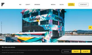
Arthaus, a real estate developer focused on workforce housing in the Bay Area, faced significant brand confusion. Their portfolio of residential and commercial properties operated under a mix of names, including the misspelled 'Artthaus', creating a disjointed identity for both internal teams and the external market. They engaged the branding vendor FLUX Branding to undertake a comprehensive rebranding and restructuring initiative.
FLUX Branding implemented a complete brand architecture overhaul, simplifying the organization and renaming the entire portfolio under the unified 'Arthaus' name. The vendor developed a new "purpose-built" brand positioning, a custom and protectable visual identity system, and an extensive messaging toolkit. The solution was expanded across all touchpoints, including templates, signage, and a detailed 200-page brand manual, resulting in a cohesive and easily understood brand that clearly communicates its mission-driven approach.
80 Case Studies