


The Creative Alchemist
30 Case Studies
A The Creative Alchemist Case Study
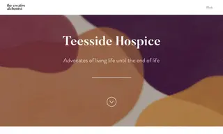
The Creative Alchemist partnered with Teesside Hospice, which supports individuals and families affected by terminal illness. The hospice's challenge was to improve its communications by creating a visual identity with more clarity and consistency that better reflected its internal values and compassionate external persona.
To address this, The Creative Alchemist developed a warmer visual identity, replacing previous cold colors with warm orange, raspberry red, and deep purples. They created a bespoke handwritten logo for a softer feel and established a clear tone of voice centered on empathy. The solution included fuzzy graphic shapes to represent compassion and a tailored typography system. The result was a new brand that effectively tells the hospice's story, which has been applied across all materials from patient information to collection tins. The team at Teesside Hospice reported that the new branding has made their communications much easier and they are thrilled with the outcome.
30 Case Studies