


The Barn
33 Case Studies
A The Barn Case Study
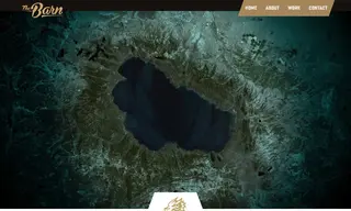
The Barn Creative was approached by the Tahoe Knight Monsters, a new ECHL hockey team, to develop a strategic brand identity. The challenge was to create a unique brand that embodied the team's aggressive and fast-paced nature while incorporating local Tahoe heritage and acknowledging its affiliation with the Vegas Golden Knights parent club.
The Barn Creative developed a comprehensive brand identity featuring a primary logo of "Tessie," the legendary protector of Lake Tahoe, supported by a system of secondary marks and a custom color palette pulled from the lake's depths. The solution included extensive brand guidelines to ensure consistency. The resulting branding was met with widespread acclaim, significantly boosting the team's visibility and marketability. It led to robust merchandise sales and fostered a deep connection with the local community, setting a strong foundation for future success.
33 Case Studies